The information found on this page was originally written by:
Chris Creamer
Saturday, February 9, 2019
The eight teams that played in the AAF were located in the southern half of the United States with Salt Lake City, Utah the most northern-based city to get a team.
When it came time to form identities, The Alliance of American Football looked to the history, population and industry of each city. “These are all things that contribute to the authenticity of a city and all things that were considered in the design process,” Bosack said. “We wanted to create marks that were profoundly connected to the cities they represent, to align with the values of the people that live in these cities and to foster a sense of pride in each market.”
Using that research, the design team then worked on color, which Bosack calls a “critical role in any branding project.” Without repeating colors across the eight teams, the group deliberately applied colors inspired by each of the team’s geography and name. As with any professional sports team, the application on the field and in retail played a key part in selecting the final hues.
Every team only got one uniform set, that’s it, no home/road sets, no alternate uniforms.
Let’s take a look at each team:
Arizona Hotshots:

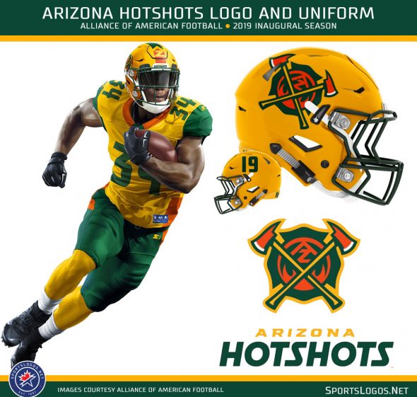
The Arizona Hotshots based their identity on the uniforms worn by U.S. Forest Service firefighters that help battle blazes in throughout Arizona. Their jersey is gold with an orange collar and green sleeves, an orange/gold/green stripe up each side of the jersey and extending somewhat onto the pants. The helmet is gold with a green face mask, the Hotshots primary logo featuring two crossed fire axes on a shield similar to a firefighter badge is one side of the helmet, the player’s number on the other, a stripe featuring an “AZ” design at the front goes up the middle.
Atlanta Legends:

The Atlanta Legends wear a crown on their helmet because “Legends wear crowns”, a reference to famous Atlanta “Kings”, Martin Luther King Jr, Hank Aaron, the 1996 Olympics. Purple and gold, the colors of royalty, like the Hotshots their helmet features a logo on just one side of the helmet with the player number on the other. The jersey is purple with gold sleeves and numbers, “ATL” up either side of the jersey in gold. Pants are gold with a solid purple stripe up either side.
Birmingham Iron

A blank black helmet! The Birmingham Iron are going black from head to toe, the blank helmet up top, the jersey with some silver stripes up either side and extending onto the pants, the player number on the front in silver. The name in reference to the history of the iron industry in Birmingham.
Memphis Express:

The Memphis Express look like they’d fit in with Nike’s vision for the NFL, the helmet a gradient from blue to red with the jet from their primary logo on the side wrapping around the back and continuing on the other side Seattle Seahawks style. The jersey is blue with red sleeves and collar, plain white numbers, and a red stripe with several thin blue horizontal stripes within it; pants are red. The name unofficially a tribute to FedEx perhaps? The large shipping company calls Memphis home.
Orlando Apollos:

The only white uniform in the league, the Orlando Apollos have a white jersey with blue shoulders, an orange collar, and orange/white/blue stripes up each side of the jersey; like the others, this striping pattern continues onto the matching white pants. The helmet is blue with an orange facemask and the primary logo on either side. The center of the back of the helmet (not pictured here) includes a large decal showing the player’s number in white with an orange drop shadow. The name Apollos is in reference to the Florida sun and the space missions which launch just a short drive from Orlando.
Salt Lake Stallions:

We saw two different helmets for the Salt Lake Stallions , could be a home/road option, could be an error, the photo of the full uniform showed a silver shell, the helmet graphic released by the league is white, both images showed a light blue face mask and logo – the mane of the horse from their primary logo. Jersey is silver with a light blue collar and sleeves, darker royal blue for the player numbers, pants are light blue with royal blue striping (which continues up the jersey). The name based off of the untamed lands surrounding the Great Salt Lake.
San Antonio Commanders:

Two shades of red, the San Antonio Commanders have a helmet in both dark red and regular red, this two-tone design culminates with a design of the Alamo on the back of the helmet. The jersey is red with dark red shoulders, grey stripes at the cuff and down the side of the jersey along with dark red and finally white at the side of the pants. The pants are silver. The Commanders name embraces the past and current history of The Alamo.
San Diego Fleet:

The San Diego Fleet are grey, dark grey, and gold in their military-inspired uniform and logo set. The helmet mismatch is on the center striping, the uniform graphic shows a series of gold chevrons while the full helmet image showed nothing in this place. Like a few other teams in this league, the Fleet are going with the logo on only one side of the helmet and sticking the player number on the other. San Diego, of course, is home to a long tradition of the U.S. Navy and Marines.